Back to Hitch
Branding & Web
Branding
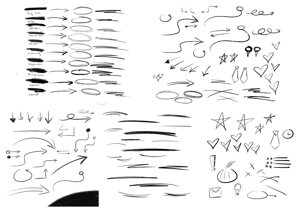
Hitch’s visual branding revolves around hand made organic marks such as pencil drawn arrows and underlines. I explored the different brush strokes and shapes that could be used in future advertising ventures.
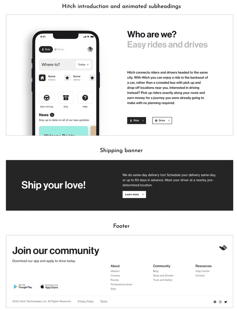
- A section underneath the hero page that explains what Hitch is for riders and drivers
- A small banner for shipping
- A footer with the current links
- Exploration on possible minimalistic animation
The website’s overall style had a minimalistic feel that I had to stay true to in all my ideation. I began with exploring possible animation ideas. The idea that the team was more enthusiastic on and accepted for their new website was the concept of a constantly changing animated subheading that will be used throughout the website. This adds an interactive element while also allowing for more information to be conveyed within a small space.


